
UX & Web Content
Level up your look, synthesize your story, structure a site that Google will love, and pave the user pathway to conversion. Here are just a few examples of site builds I’ve led.
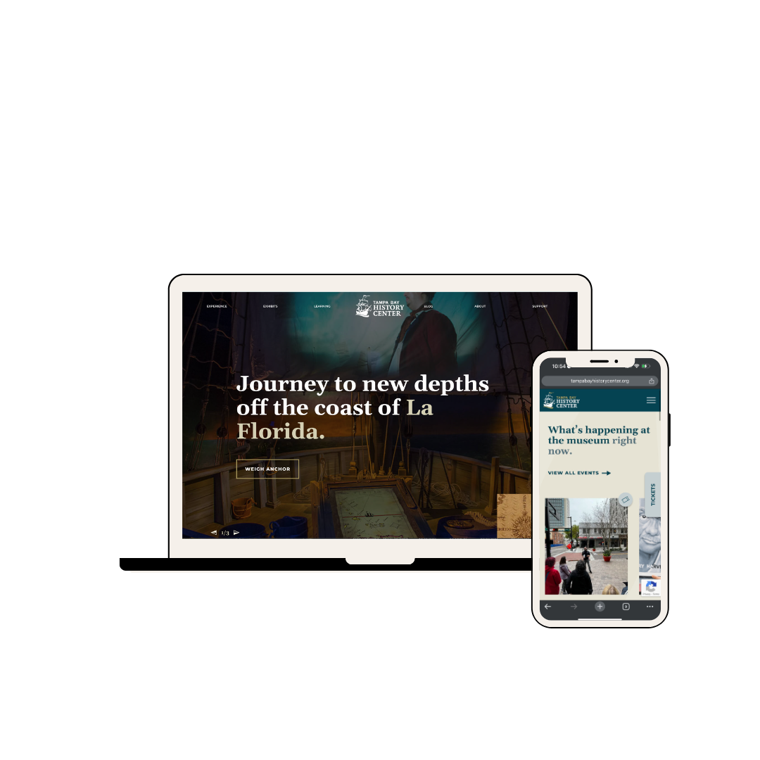
Remaking history for visitors and researchers alike.
A celebrated city museum needed to make its dated website a thing of the past. Serving as Creative Director, UX strategist, and lead copywriter, Rachel brought her own deep experience with historical artifacts out of the archives for this one. Leading strategic exploration and user journey mapping, she worked with the team to build an entirely new site architecture that delivered a modern virtual experience that worked for all of the museum’s diverse users — visitors, educators, researchers and donors.
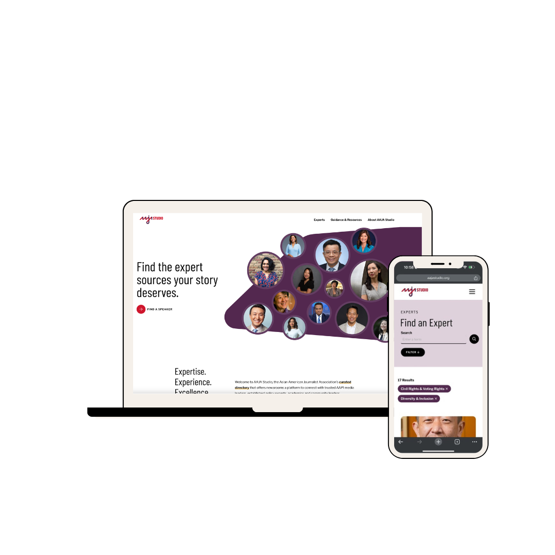
New site builds toward better representation in the news.
The Asian American Journalists Association (AAJA) needed a new website for their studio — a comprehensive online directory designed for newsroom casters to easily book specialists and community representatives. AAJA wanted a modern, professional experience that also captured the urgent need for diversity and better representation in news media. As UX strategist and Creative Director, Rachel helped the team find the balance between the story and the stats, the people and the purpose, and ultimately led the project’s execution from initial brand strategy sessions with the client through to wireframes, copy, design and development.
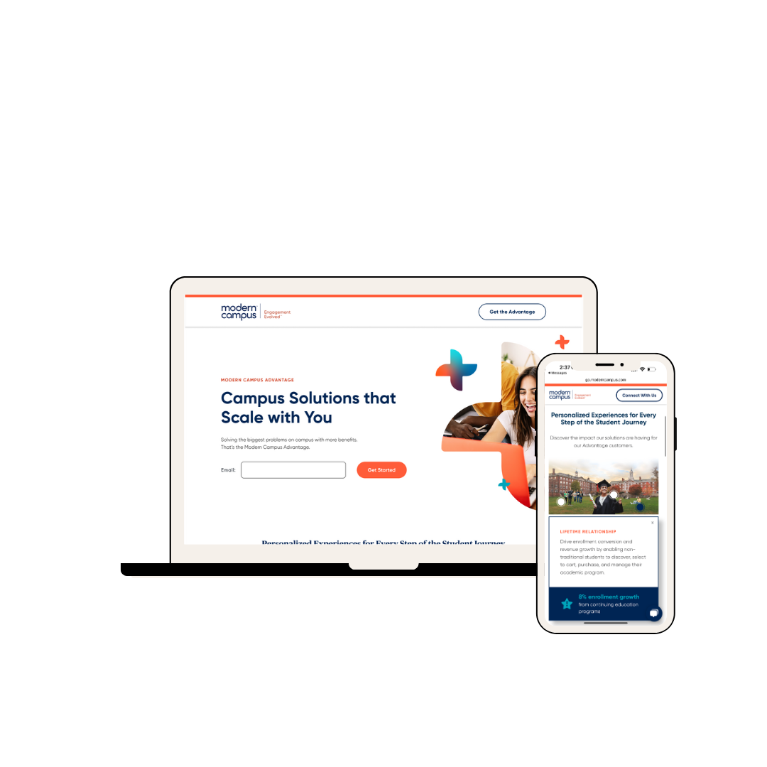
An interactive SaaS EdTech landing page designed to convert.
Modern Campus needed to launch a landing page for their new benefits program to help its sales team upsell and to drive online conversions. As UX strategist, Rachel analyzed their existing landing pages’ performance and heatmaps, and conducted industry research to inform my wireframe and copy. Bringing together elements primed for conversion (e.g., simple CTA sign-ups, clear value props) and interactive components to assist sales teams, she led the team as Creative Director through the wireframe and copy phase and into design, custom animation, and interactive development.
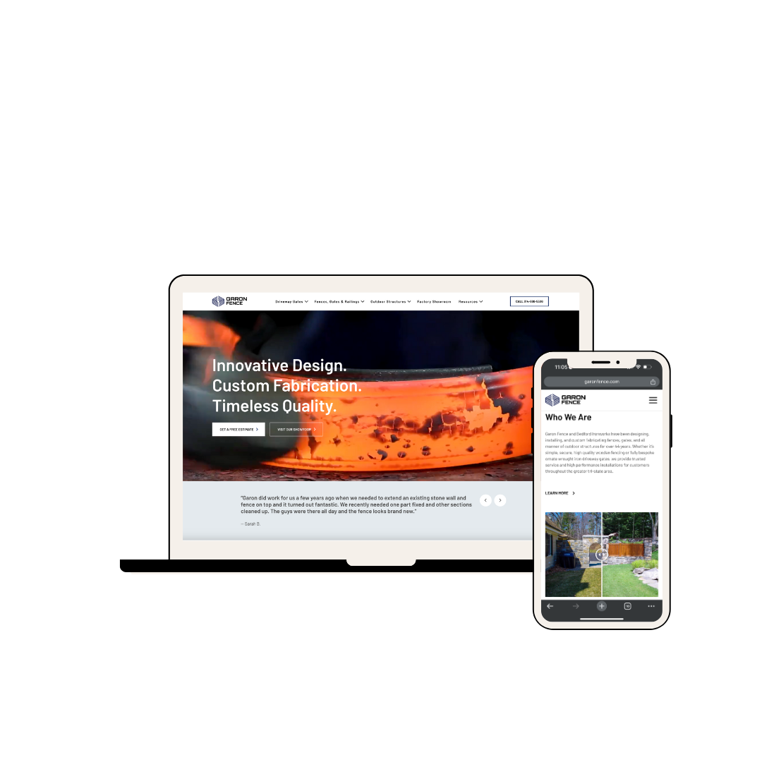
High-end construction meets approachable service.
Garon Fence was looking for an overhaul on their website in order to increase their leads. They were looking for a boost that elevated their brand presence and improved their local SEO. Together, Rachel and Kate led the build of a site that balanced strong visuals with easy navigation of a robust product catalogue. (Rachel also served as Creative Director for the hero video.)
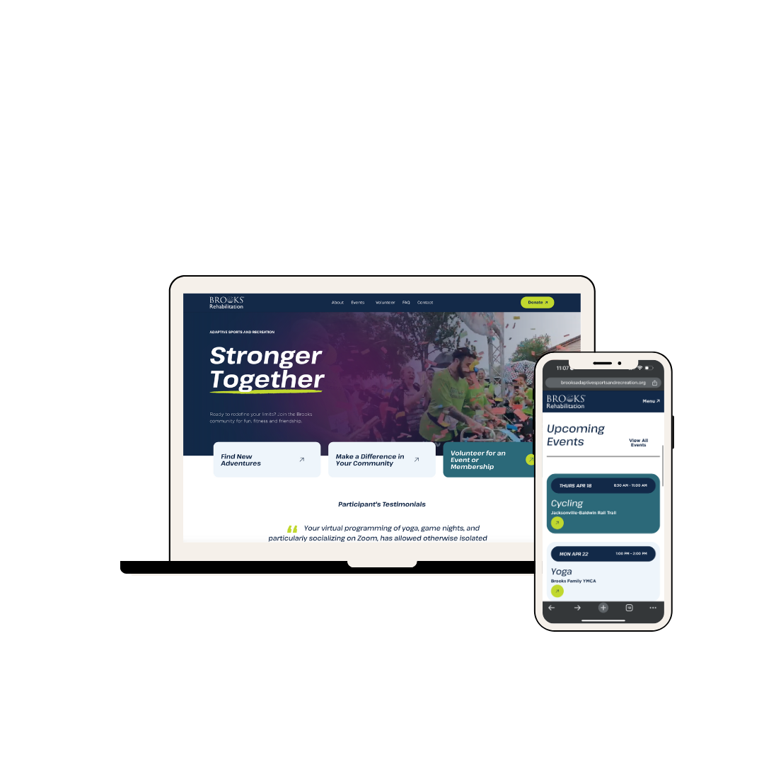
Adaptive sports site that helps patients stay active.
Our client is a state-of-the-art sports rehabilitation center that boasts some of the most innovative technologies and doctors in the country — but their dated website was woefully bare-bones. Rachel and Kate led the team together to create a small but action-packed site that amps up prospective patients and cheers on existing ones. The existing brand included high-resolution sports photography, palettes of bold purples and neon greens alongside sleek sans serif fonts. The only problem? The existing site and brand presence didn’t make use of any of it! Working with the team, we brought those sporty vibes to the forefront, italicized their fonts, and added some sleek arrows and underline accents to give the entire site that crackle of energy it needed to charge up the users. And while the client had limited content to share, we made the most of it by developing a big, bold layout and user experience that made things clear, easy, front and center.